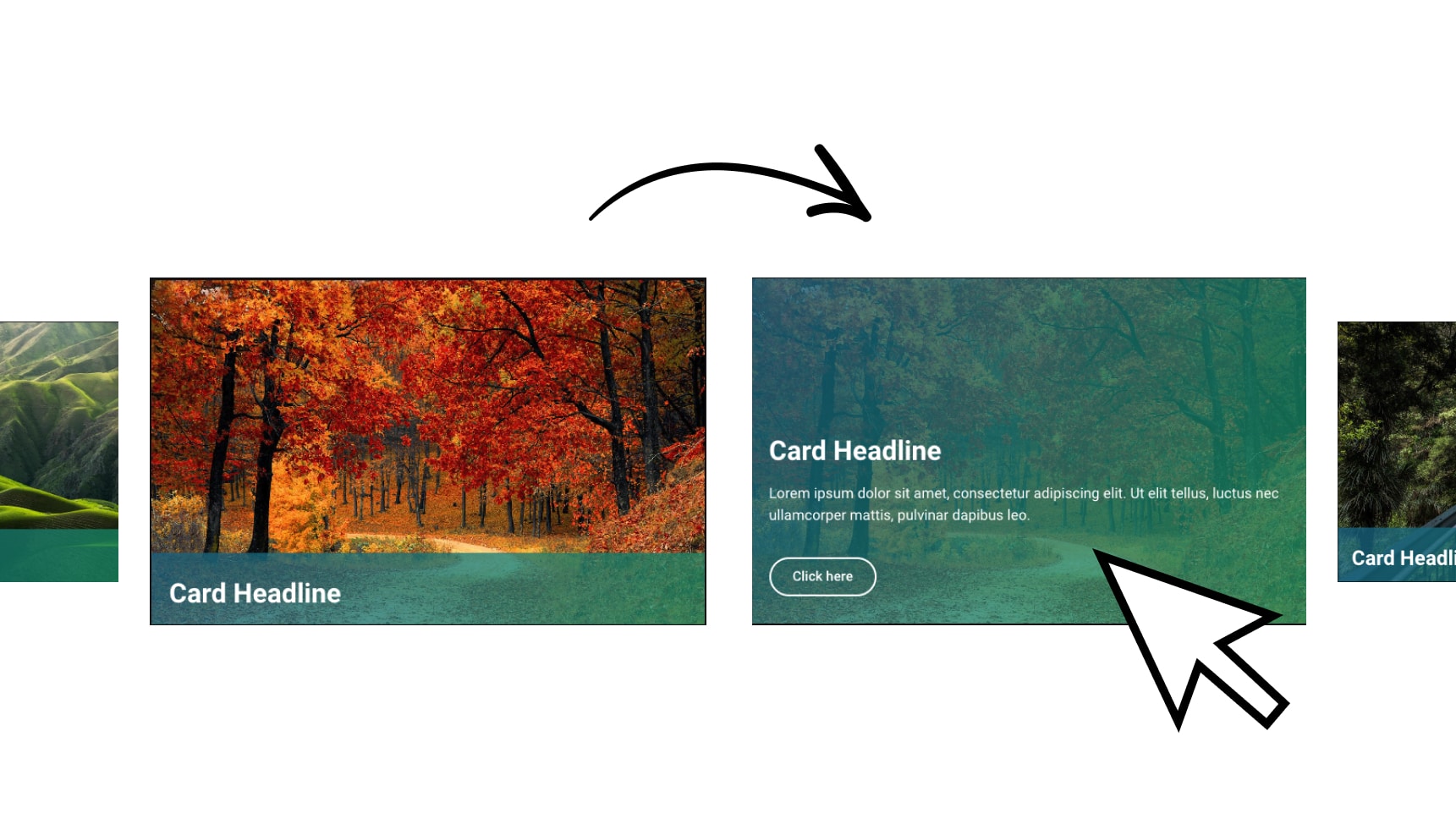
Create Your Glass Effect Here:
Mobile Section
					/*Mobile section*/

selector{
position: fixed;
width: 100%;
bottom: 0px;
background: rgba( 0, 0, 0, 0.85 );
backdrop-filter: blur( 4px );
-webkit-backdrop-filter: blur( 4px );
}
Icon Box
					selector{
background: rgba( 0, 0, 0, 0.35 );
border-radius: 10px;
border: 1px solid rgba( 255, 255, 255, 0.18 );
margin: 0px 5px 0px 5px
}
selector:hover{
border: 1px solid #6267FF;
}
span:hover{
color: #6267FF;
}


Hey US, this is so cool..!! thank you. I created one with your instructions and it looks nice on the website. the problem I had is that, the app menu is not floating with the page when I scroll and is fixed at the bottom. Not sure what was wrong. i don’t have the elementor pro version and I’m using the free methods you suggested. thanks
Since you are not using the pro version. You’ll need to add a CSS class to the main section and than paste the CSS in the customizer. Like this example
.class-name{
position: fixed;
width: 100%;
bottom: 0px;
background: rgba( 0, 0, 0, 0.85 );
backdrop-filter: blur( 4px );
-webkit-backdrop-filter: blur( 4px );
}
it worked out perfectly. than you so much US