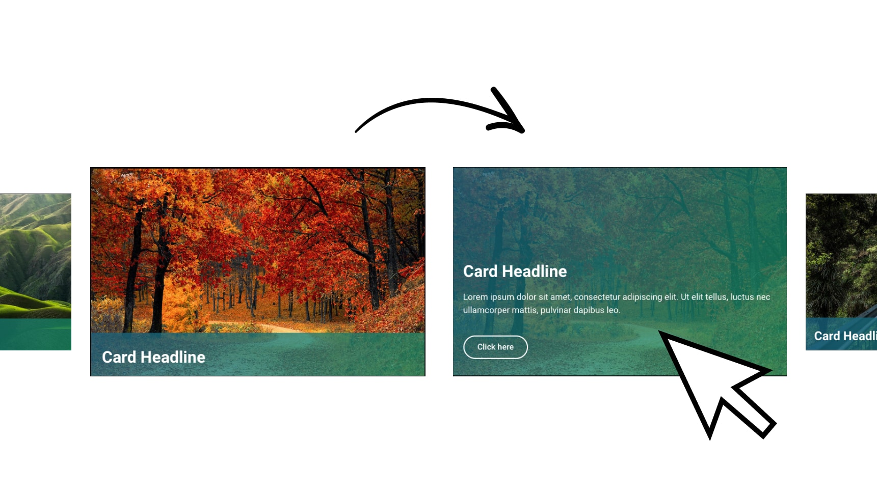
Elementor Hover Box Animation Effect In WordPress

Facebook
Twitter
Reddit
WhatsApp

CSS Code

				
					selector .elementor-widget-wrap::before {
    content:"";
    position: absolute;
    bottom:0px;
    left: 0px;
    background-color: #F54335;
    width: 100%;
    height: 0%;
    transition: height 0.15s ease-in;
    border-radius: 10px;
}

selector .elementor-widget-wrap:hover::before{
    height: 100% !important;
}

selector .box-title h2{
    transition: all 0.1s ease-in;
}

selector:hover .box-title h2{
    color: white !important;
}

selector .box-des p{
    transition: all 0.1s ease-in;
}

selector:hover .box-des p{
    color: white !important;
}

selector .elementor-button{
    transition: all 0.1s ease-in;
}

selector:hover .elementor-button{
    color: black;
    background-color: white !important;
}


Subscribe
Notify of
0 Comments
Inline Feedbacks
View all comments

More to explorer

How To Make a Hover Card Like a PRO in Elementor

https://youtu.be/pja-7Sfn8WI CSS selector .card-content{ height: 56%; margin-bottom: -134px; transition: all 0.5s ease; } selector .card-wrapper:hover .card-content{ margin-bottom: 0px; height: 100%; } selector

Elementor Button Border Gradient Tutorial

https://youtu.be/I9am2K_yopc Border Gradient Button CSS selector .elementor-button{ position: relative; overflow: hidden; z-index: 1; margin-bottom: -15px } selector .elementor-button:before{ content: ”; position: absolute;

0
Would love your thoughts, please comment.x
()
x

45 Minute Wordpress Support

Get your Wordpress questions answered and your Wordpress issues resolved.